Image of India’s Map claiming to recognize Indian Gov’s COVID-19 managing efforts is 4 years Old
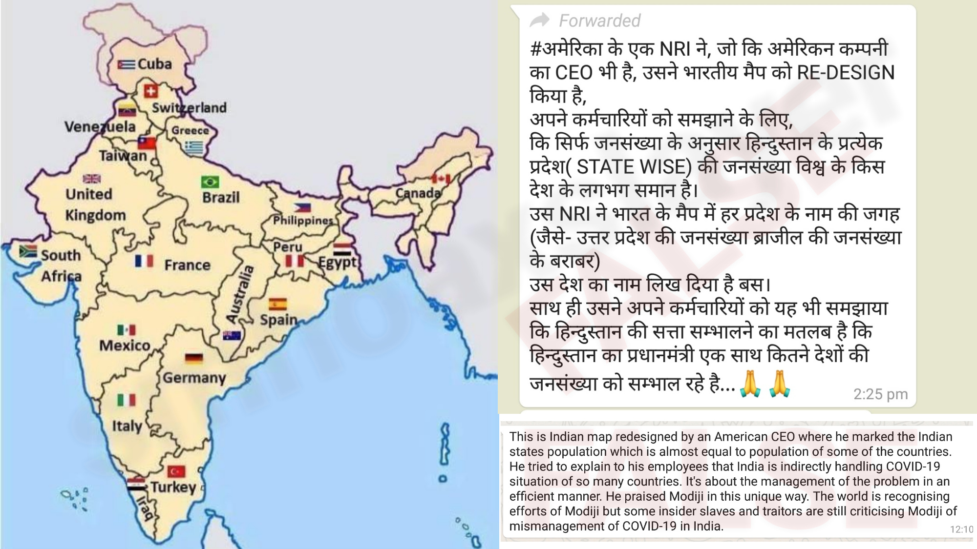
Claim: “This is Indian map redesigned by an American CEO where he marked the Indian states population which is almost equal to population of some of the countries. He tried to explain to his employees that India is indirectly handling COVID-19 situation of so many countries. It’s about the management of the problem in an efficient manner. He praised Modiji in this unique way. The world is recognising efforts of Modiji but some insider slaves and traitors are still criticising Modiji of mismanagement of COVID-19 in India.”
Ram Madhav (National General Secretary, Bharatiya Janata Party & Member, Board of Governors, India Foundation) tweeted –
Interesting map pic.twitter.com/l7BdZ8BW9g
— Ram Madhav (@rammadhavbjp) April 15, 2020
(archive)
Rohit Kumar Singh (Twitter Bio – Additional Chief Secretary Department of Medical Health & Family Welfare Government of Rajasthan.) tweeted (archive) –
मेरा भारत महान 🙏🏼 pic.twitter.com/WbC3ZrgFWA
— Rohit Kumar Singh (@rohitksingh) April 14, 2020
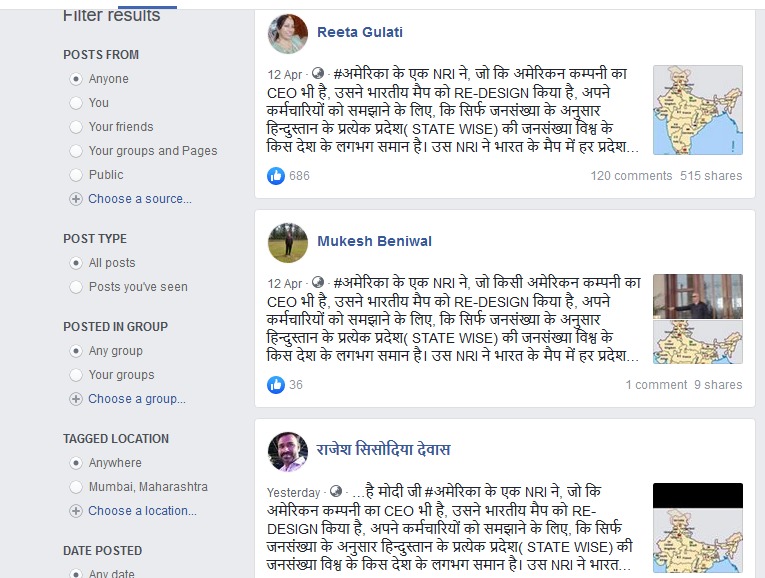
Following post by Mahesh Mittal posted in a public group “PMO India” has been shared by approximately 500 people
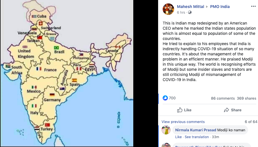
The above post is doing the rounds on social media, with the explanation of how the government has been handling the current Coronavirus situation of the country. The post tries to explain how the world is “recognising efforts of Modiji” and that “traitors are still criticising Modiji of mismanagement of COVID-19 in India”.

Indian Achivement
This is Indian map redesigned by an American CEO where he marked the states population which is almost equal to population of some of the countries. He tried to explain 2 his employees that India is indirectly handling COVID-19 situation of so many countries. pic.twitter.com/QeSNFaJ3Zi
— Bh@W!N_N (@BhaWin_N) April 14, 2020
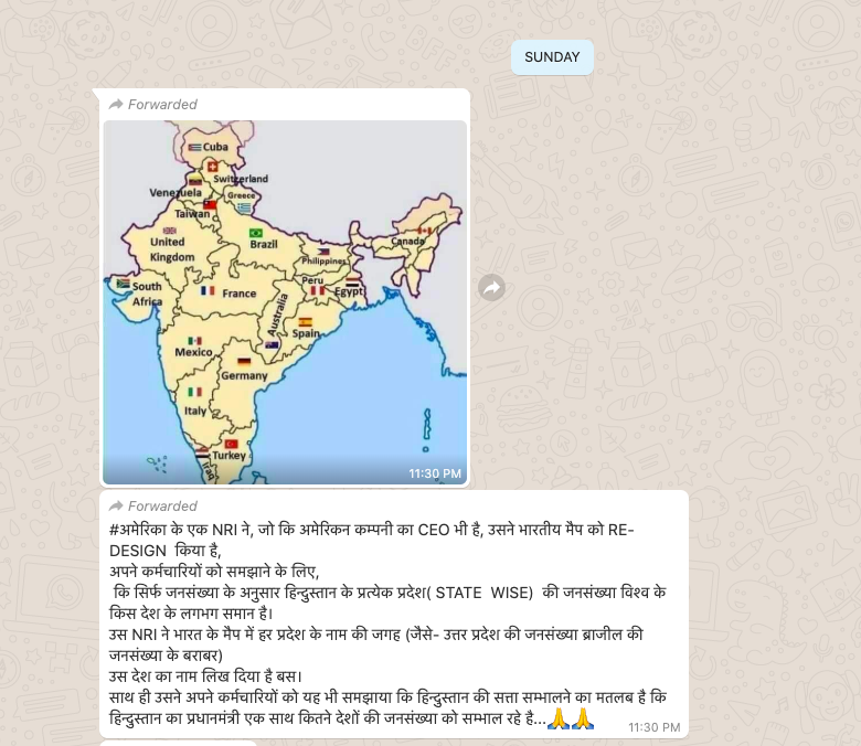
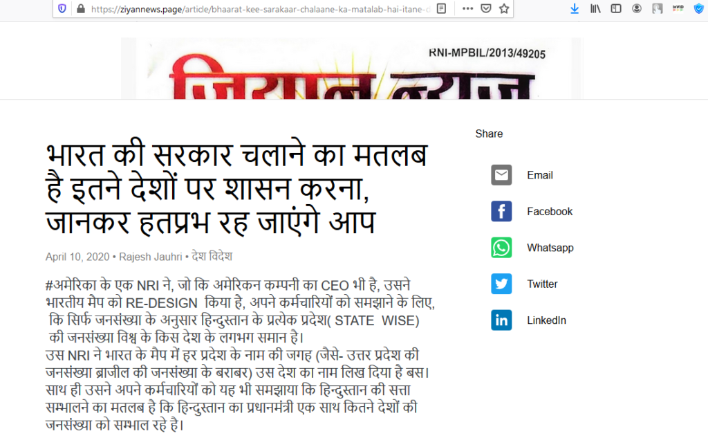
The image also went viral few days earlier, and also in May 2019, with a slightly different context and in Hindi. The text read,
“अमेरिका एक NRI ने, जो कि अमेरिकन कम्पनी का CEO भी है, उसने भारतीय मैप को RE-DESIGN किया है,
अपने कर्मचारियों को समझाने के लिए,
कि सिर्फ जनसंख्या के अनुसार हिन्दुस्तान के प्रत्येक प्रदेश( STATE WISE) की जनसंख्या विश्व के किस देश के लगभग समान है।
उस NRI ने भारत के मैप में हर प्रदेश के नाम की जगह (जैसे- उत्तर प्रदेश की जनसंख्या ब्राजील की जनसंख्या के बराबर)
उस देश का नाम लिख दिया है बस।
साथ ही उसने अपने कर्मचारियों को यह भी समझाया कि हिन्दुस्तान की सत्ता सम्भालने का मतलब है कि हिन्दुस्तान का प्रधानमंत्री एक साथ कितने देशों की जनसंख्या को सम्भाल रहे है.”
It was viral on Twitter, and Whatsapp as well

We also came across a certain news article which said the same.
TRUTH
The image is 8 years old so it’s not related to Corona Virus and was meant to compare population of India vs America
No one has mentioned any details like name of the American CEO, name of his company, not provided any credible link which makes this sound like a fiction which actually it came out to be.
UPDATE: On replying to Mr. Ram Madhav and after him retweeting our reply, we received a reply from Apan Srivastava who claimed he made this image in year 2012 and used in a reply on Quora, he gave us the link too.

Thanks @SMHoaxSlayer. Actually, this image was created by me using MS paint, for a Quora answer 8 years ago : https://t.co/P0hOICcdZD. Back when I used to have too much time on my hand.
I am flattered that ppl think that American CEOs spend their time doing this kind of shit. 😂— Arpan Srivastava (@appysrivastava) April 15, 2020
We did a Google Reverse Image search of the image of the map, and it led to to various tweets from the year 2016, in which the map is posted only to compare the approximate population of various countries to that of Indian states.
Amit Ranjan, (CoFounded SlideShare. Crossed the startup – government chasm. Architect @ DigiLocker, #IndiaStack, National eGov Div, IT Ministry, Govt of India.) tweeted this image, in 2016
Thought provoking map! –> "Indian states mapped to countries of equivalent population" #map #population pic.twitter.com/NDzMXA0Rj9
— Amit Ranjan (@amitranjan) April 13, 2016
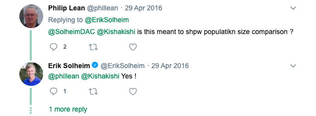
Erik Solheim, who is a Norwegian diplomat also tweeted the image in 2016, to discuss the enormous population that India has.

When someone asked him about the purpose of the image, he cleared in reply that it’s about Population comparison.
The sole reason is to highlight the comparison between the population of India’s states and the various other countries. Though the image is an interesting take on the comparison, it has absolutely no relation India’s COVID-19 response in the country, and neither is there any reportage of who the American CEO is who made the map.


